728x90
반응형
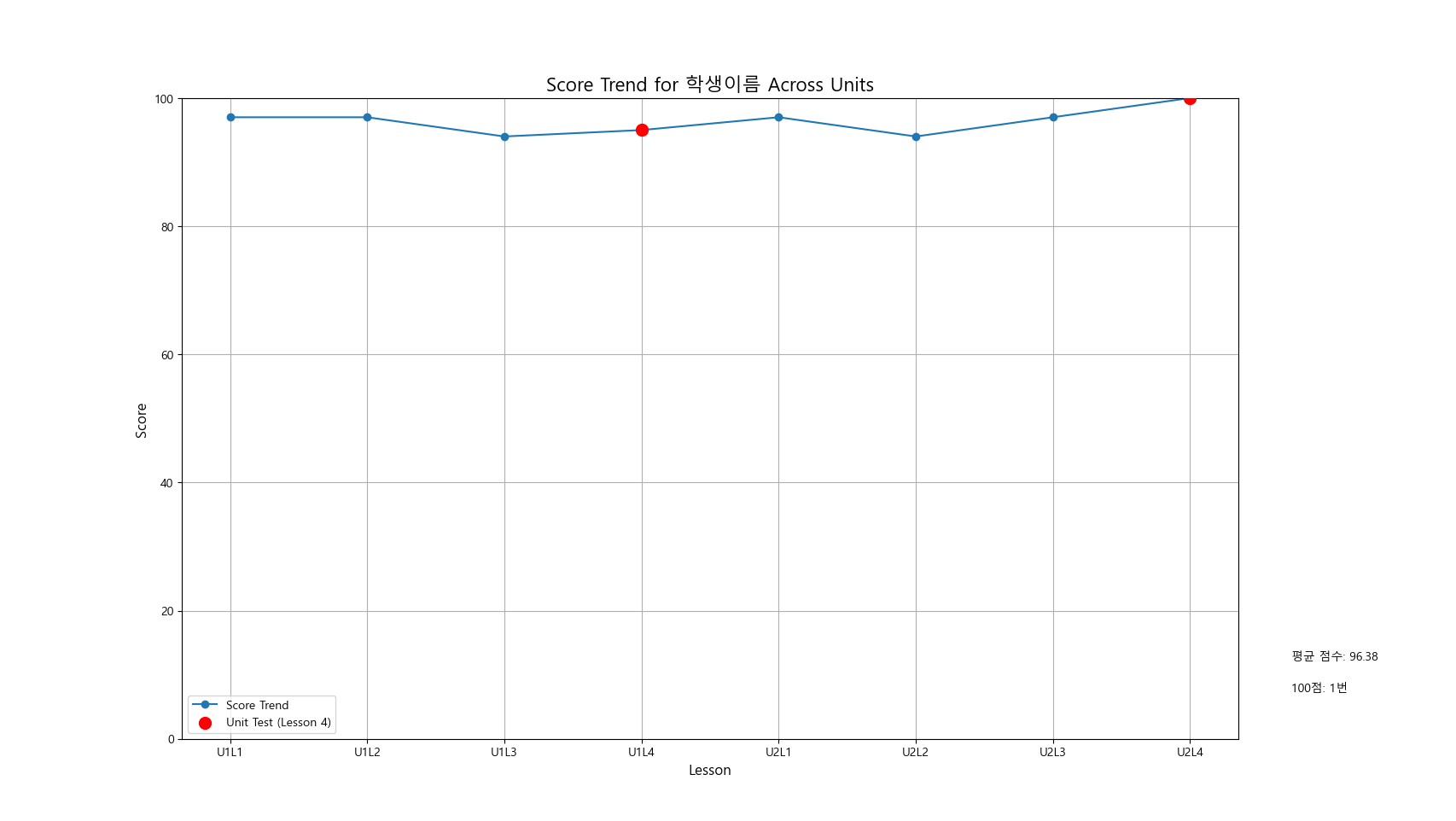
import pandas as pd
import matplotlib.pyplot as plt
import matplotlib
# 한글 폰트 설정 (Windows에서는 'Malgun Gothic', macOS에서는 'AppleGothic' 등을 사용할 수 있음)
matplotlib.rcParams['font.family'] = 'Malgun Gothic' # Windows에서 사용할 수 있는 한글 폰트
matplotlib.rcParams['axes.unicode_minus'] = False # 마이너스 기호가 깨지지 않도록 설정
# 데이터 입력
data = {
"Name": ["학생이름"] * 8,
"Unit": [1, 1, 1, 1, 2, 2, 2, 2],
"Lesson": [1, 2, 3, 4, 1, 2, 3, 4],
"Score": [97, 97, 94, 95, 97, 94, 97, 100]
}
# 데이터프레임 생성
df = pd.DataFrame(data)
# Lesson을 연속된 번호로 변경
df['Global_Lesson'] = (df['Unit'] - 1) * 4 + df['Lesson']
# 점수의 평균 계산
average_score = df['Score'].mean()
# 100점 받은 횟수 계산
perfect_scores = (df['Score'] == 100).sum()
# 선 그래프 그리기
plt.figure(figsize=(8, 5))
plt.plot(df['Global_Lesson'], df['Score'], marker='o', label="Score Trend")
# Lesson 4 강조: 빨간색 마커와 더 큰 마커
lesson4 = df[df['Lesson'] == 4] # Lesson 4의 데이터
plt.scatter(lesson4['Global_Lesson'], lesson4['Score'], color='red', s=100, label='Unit Test (Lesson 4)', zorder=5)
# 그래프 제목에 아이의 이름 포함
plt.title(f"Score Trend for {df['Name'][0]} Across Units", fontsize=16)
# 그래프 꾸미기
plt.xlabel("Lesson", fontsize=12)
plt.ylabel("Score", fontsize=12)
plt.xticks(df['Global_Lesson'], labels=[f"U{u}L{l}" for u, l in zip(df['Unit'], df['Lesson'])])
plt.legend()
plt.grid()
# Y축 범위 설정
plt.ylim(0, 100) # 0부터 100까지 설정
# 우측 여백을 더 만들어서 텍스트 추가
plt.subplots_adjust(right=0.85, bottom=0.1) # 하단 여백을 더 줄임
# 그래프 하단에 평균 점수와 100점 횟수 추가
plt.text(1.05, 0.12, f"평균 점수: {average_score:.2f}", fontsize=10, verticalalignment='bottom', horizontalalignment='left', transform=plt.gca().transAxes)
plt.text(1.05, 0.07, f"100점: {perfect_scores}번", fontsize=10, verticalalignment='bottom', horizontalalignment='left', transform=plt.gca().transAxes)
# 그래프 출력
plt.show()
>> 출력물
728x90
반응형


